How to Create Book Covers
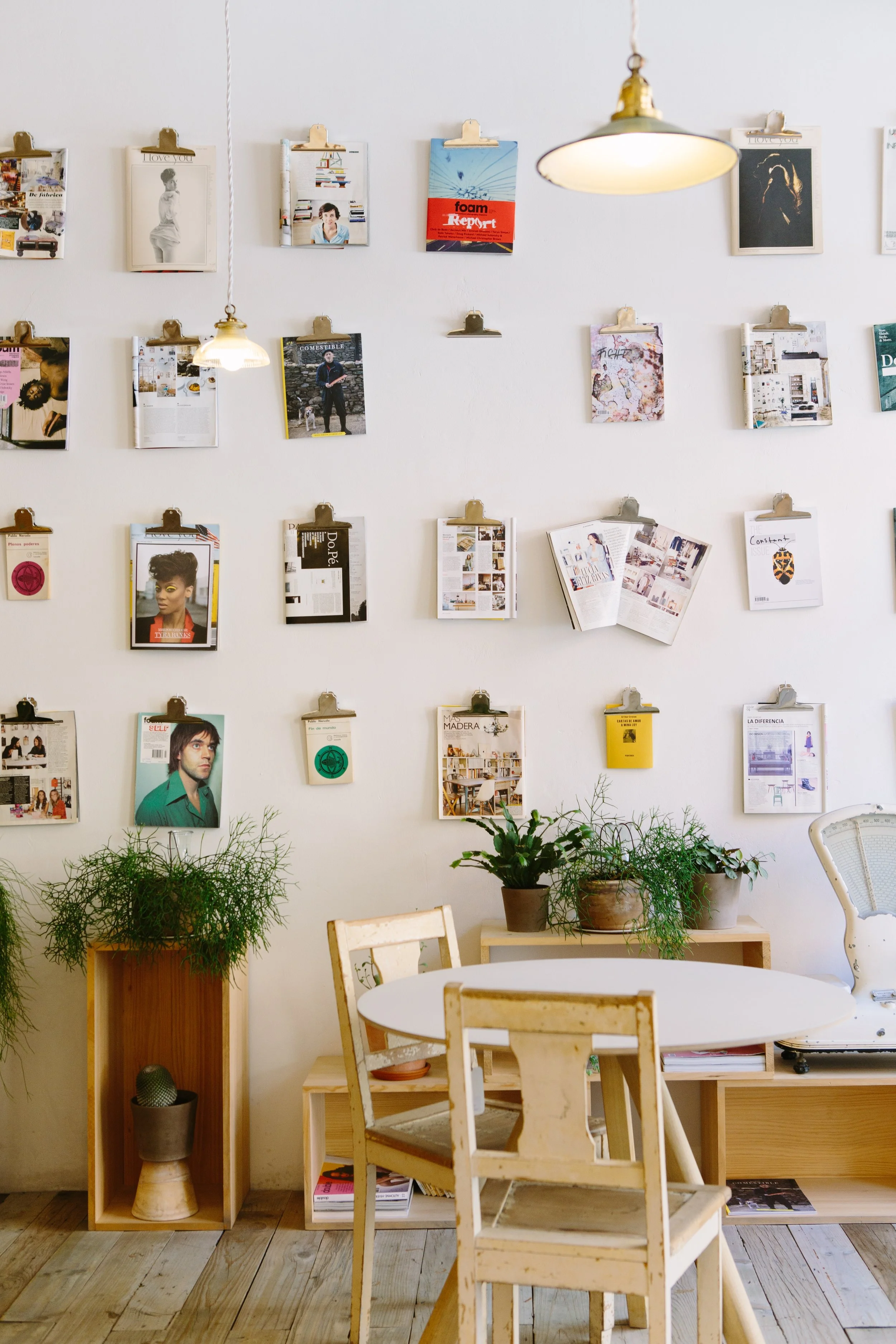
Photo by Jason Briscoe on Unsplash
I enjoy making book covers in my free time for my own books or for clients. I think book covers are especially fun, because you can do almost anything you want with them. They’re so much more creative then designing for other products.
Start with Research
Usually I will make sure I read the story first and take notes on anything that pops up to me. Sometimes its recurring characters, character descriptions, world building, images provided in the story, themes, etc. Then I’ll ask the author to get an idea of what they have in mind. Some authors are not very good at designing, but usually they have a good idea in their mind of what would best represent their story.
Some good questions to ask an author when gathering ideas are:
Can you show me a cover that’s similar to what you have in mind?
Can you provide me with a character profile?
What colors do you associate with your story?
What are the main themes of your story? What’s the main message?
Do you have any maps, Pinterest board, Spotify playlists, or other media related to your book you can send?
How would you describe the way your characters look? What is the relation between the main characters?
Describe the main location of the story to me.
Are there any important objects in the story?
Describe the mood of the story to me in five words or less. How about one?
Depending on the story, I’ll also do some research and see what is going on in the market and see what people are saying about covers. They say don’t judge a story by it’s cover, but a lot of people still comment. I like to walk around Barnes and Noble and see what catches my eye but also look on Amazon and Goodreads. You want a cover that reflects the genre and story, but also stands out and is very eye catching in person and digitally.
I also like to sketch my ideas, although I’m not a great sketcher, so I’ll usually start looking for images that I want to use or that give me a similar vibe to what I’m looking for. Then I’ll create a moodboard using Pinterest and photoshop and share those with the marketing department (if I was working with one) or the author to see if I’m going in the right direction.
Sometimes the author already has stuff out there, so I like to see what else they’ve written and if it’s an older series, what has already been done so I’m not doing something too similar.
Start Designing
My covers are also a lot of image manipulation. I use photoshop and Illustrator a lot. But I’ll also use other programs depending on what I do or how much work I’ll need to put in. Some covers don’t require a lot of work, I can find one image or a couple that I can easily merge together.
I typically look for images via free stock sites like Unsplash and or I’ll buy them from Adobe Stock Images. Sometimes it will take a while to find the right images, but don’t give up if you don’t find what you’re looking for right away. If you are looking for something super specific, you can always hire a photographer and models to help you create your own images to use.
Here is an Adobe Stock Image I bought a couple years ago and then manipulated to use for a collection of short stories I published. The author name isn’t that easy read but when you zoom up on it, it is easier.
I usually like to make a couple versions of a cover and present those to see what works and what doesn’t work. I also like to start with a front cover design and then move onto a full cover. You can find cover templates on self publishing sites to make sure you have the right dimensions.
A full cover usually requires a little bit more work because not only do you have the title, author name, and image to work with, but you have to expand the front design through the spine and back cover. Then if its a hard cover or paper back, there might be jacket flaps that also need designing. Not only that but you might have testimonials, the blurb, author bio, publishing house information, and the ISBN code to add. I would recommend not using more then three typefaces for covers. You want the Title typography, one for the author or tagline, and another for any other copy.
When it comes to typography, I also feel it’s very important to make sure that it reflects the genre, story, and mood of the pieces. You can design your own font for this or find one already made. The catch here is that they might be very expensive or have certain rules so just make sure to read everything carefully. Then the legibility is really important. Because while you want it to look good, you also want the readers to be able to read it. So think about color and font treatments like gradients, shadows, bolding, and type weight and style.
Make sure to save your work frequently and save multiple versions so you can come back to them later if needed.
Feedback, Revise, Deliver
Then finally after you’ve gotten your feedback, make any changes, and I always advocate to double check how it looks in black and white, and if it’s a solely digital cover, print it out anyways just in case. Then I always send off a final version of the cover with all the images, fonts, and other materials attached as long as an image copy, PDF copy, and the design files used like Photoshop and Illustrator. You can deliver all your files using free storage places like Dropbox and OneDrive. Always remember to name your files correctly such as, booktitlebookjacketfinal, or booktitle_frontcover_versionone.
*Note that you can also find premade covers or templates, but I think those are pretty boring to use unless you’re publishing an ebook on a nonfiction topic or an essay and you don’t really care too much.


