Trinity Care - UX Rescue
UX Design
Overview
Project Type: UX Research + Design
Team Members:
Kierra Long, Gabrielle Jamora , Jenny Lee
Business problem:
Trinity Care Foundation Uganda relied heavily on tourism to support their efforts. Due to the COVID-19 pandemic, this source has come to a halt and the organization has need to increase funds, and also find ways to get volunteers, increase awareness, and increase transportation ability.
We needed to understand their most pressing need in order to facilitate the best point of intervention to create a business, service, or system that will help with their needs.
My Role and Methods:
As one of the designers on the team with the most technical experience, I focused specifically on the usability of the website for the users and for Trinity Care. I took in consideration their technical abilities as their connection to the internet can be lacking and they don’t all have the latest and greatest devices. I wanted to make it easy for them to update on their own and make it easy for people to sign up for volunteer roles.
I contributed to the design by making the wireframes and by designing the live website.
Selected Outcomes:
Trinity Care has been getting requests for volunteers
They are in the process of signing up for an international bank account in order to accept international donations locally and through their website.
After some discussion, we set them up on a Weebly website since it would be free hosting and a domain and it is easier for them to update without a lot of technical knowledge.
Expanded Case Study:
Design Brief
Background
The organization was founded in 2010, so far have been providing scholastic materials, clothing, supplying food, soap to orphaned, elderly, widows and disabled. Got involved in the empowerment of widow's activities like tailoring, farming to make them earn a living. This is helped by the donations received from Escape Adventure Tours Ltd which comes 15% of their profits.
About Trinity Care Foundation Uganda
Location: Buwenda village, mafubira sub county, Jinja district, Uganda, Africa.
Organizations purpose: To support and help the underprivileged people, vulnerable people, orphaned children, disabled, widows and elderly.
Volunteer source:
From bujagali campsites, Internet, recommendations.
Stakeholders
Members contribution
Fundraising
Volunteers
Design Constraints
The organization and area has limited internet access
This project has no budget
They relied on revenue from tourism sources which are no longer due to COVID
Funding source: Escape Adventure Tours Ltd. Volunteers. Board members. Fundraising. Church.
How might we help them?
Getting a website
Source of funds
They have a big demand of people in need
Transport to check on the children while at schools
Few necessarily needs for the disabled, widows and elderly
Initial Ideation
Fundraising and finding alt revenue sources, donations
Finding volunteers
website creation
Increase visibility and awareness of the organization
Help them with communication of what they do and their impact
Part 1: Research
My team and I decided to meet weekly in order to meet our deadlines and have time to work on the project without overwhelming ourselves.
Stakeholder interview
As part of our process, we started out with a call to the organization in order to learn more about the problems we could help solve and other ways we could assist them. I called them and lead the interview.
Competitive Analysis
Next we conducted competitive analysis on several other non-profits and organizations based in Uganda. We wanted to find out if they were also receiving donations, volunteers and what their websites looked like.
Desk Research
Next we each took a section about Uganda and conducted our own research to learn more about the country. We then took turns presenting about the economy, the environment, the government and history, and the state of widows and children in the country.
Recruitment and Surveys
We conducted two separate surveys based on our two different user groups - 1) volunteers, 2) donors. We used these surveys to find people to interview.
User Interviews
We conducted several interviews in order to find out more information about people who volunteer overseas and those who donate internationally.
part 2: Ideation
Customer Journey Mapping
User Scenarios and Storyboarding
Next we created user scenarios and create storyboards based on the research we conducted so far.
Information Architecture
I created the information architecture based on our customer journey maps and using SEO techniques.
Pain Points and Solutions
Next we organized the pain points and positives based on our users.
Personas
We created three personas based on our user interviews. Someone who is interested in just volunteering abroad, someone who is interested in donating abroad, and someone who is interested in doing a bit of both.
Affinity Mapping
Our next several sessions were creating an affinity map so that we could understand what our users wanted and weren’t getting. This helped us visualize and understand them better.
part 3: Design
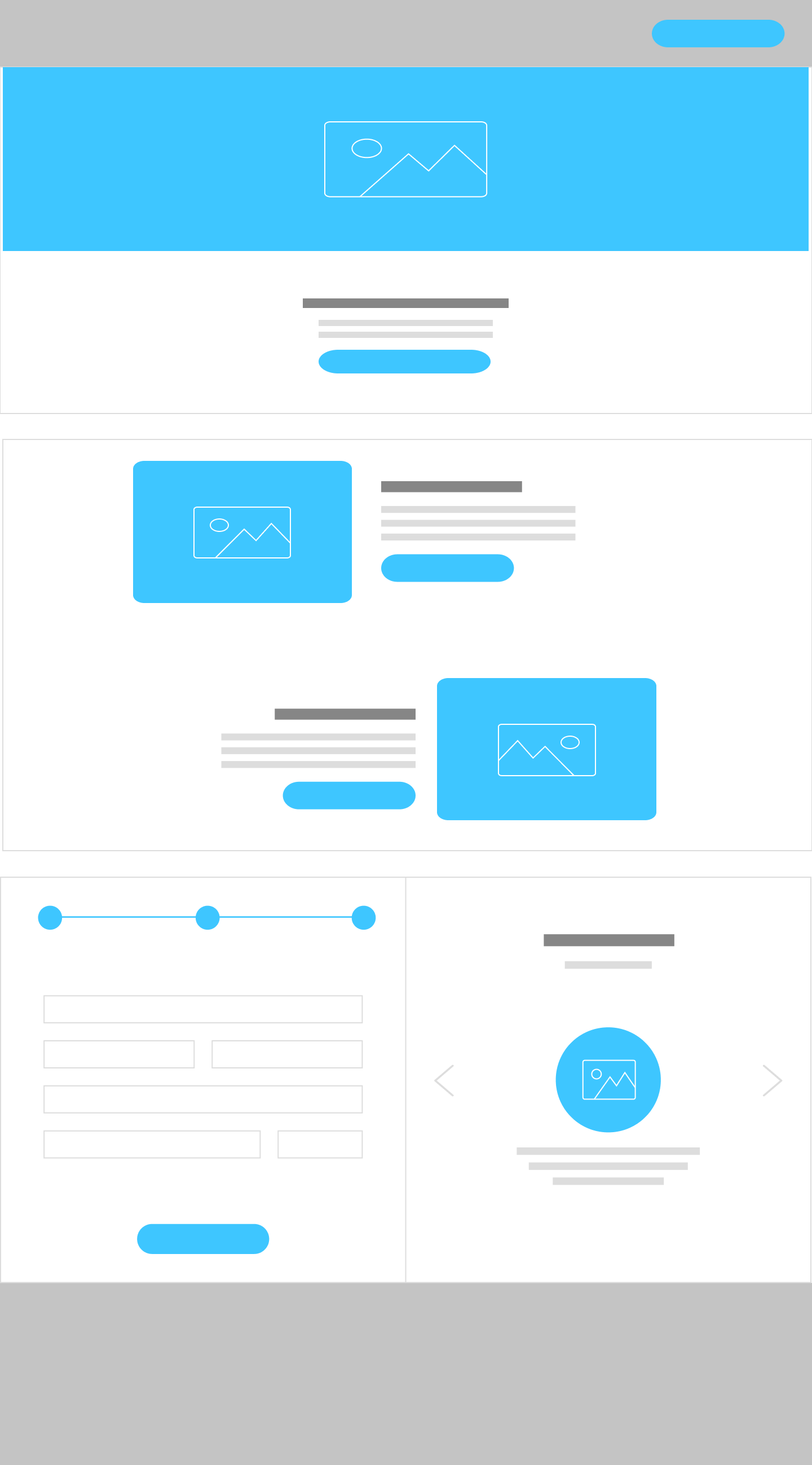
Wireframes and mockups
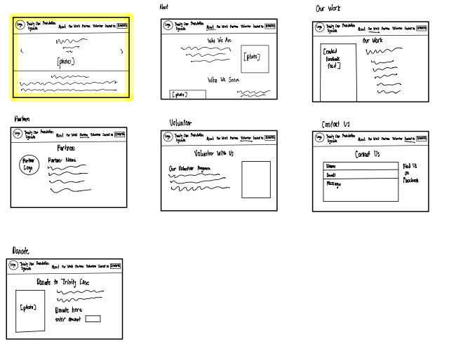
We spent a week and a half coming up each with our own wireframes and mockups for the website. We started with paper drawings, progress to digital mockups and then the prototype.
Sketches
We each created a series of sketches based on our research data and then presented them to the group. As a team we selected what we liked about each sketch and worked on combining those.
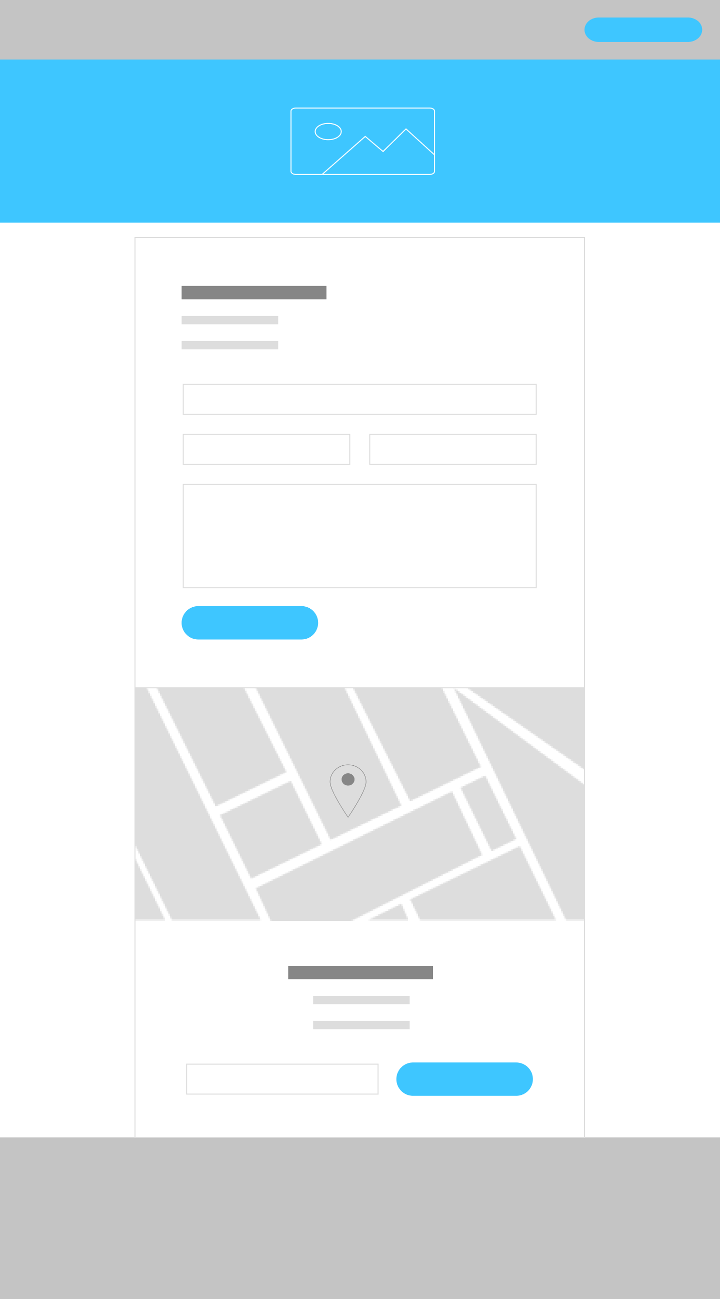
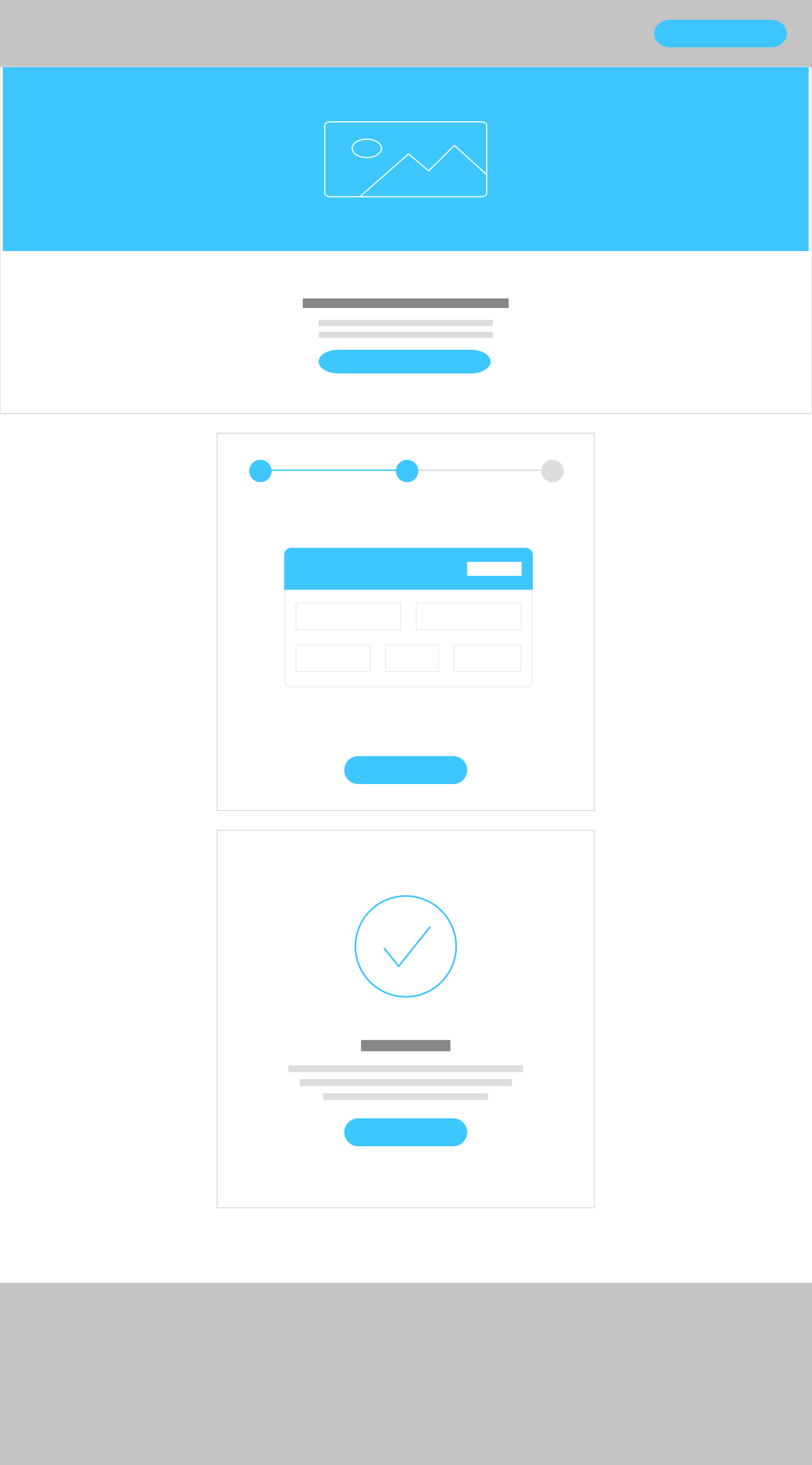
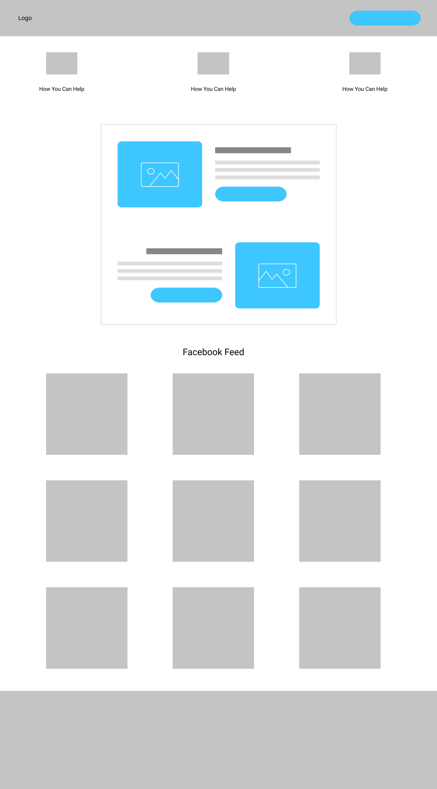
Wireframes
Mid-Fidelity Mockups
Branding and Color Scheme
H1: Raleway
H2: Open Sans
Body text: Nunito
Content Creation
We each spent several weeks organizing and creating the content for the website. We were given the names and photos of each of the staff as well as direction on what would fit onto each page.
Setting up the Volunteer Information
For the volunteer information, we set up a form that allows users to directly fill in their information that is then directly sent to Trinity Care for review.
Setting up the Donations
International donations were trickier than we initially thought they would be. We spent several weeks trying to figure out how to get donations to Uganda since a lot of the original sites we looked at didn’t offer donations to Uganda. Eventually, Trinity Care is in the process of setting up an international bank account through which they can accept donations from Mastercard.
The Website
It was really important based on our user data that we highlighted specific people in the community who people can help.
Since their Facebook page consistently gets a lot of followers and engagement, we wanted to make sure we highlighted it on the main page for them.
Since our users had highlighted they wanted to know how their donations will be used, we make sure to list specific ways that their money will help the community.
Eventually when they get donations set up, we would like to add a selection for donations to make it easier for people to choose what to donate. We also think it would be helped to add context on what the dollar choices will help out with so that they have some context.
Tutorial and Handoff
For the final stage of our process, we created video tutorials on how to log into the site and make edits. We emailed them the log in information and a few more directions.
LEARNINGS AND OUTCOMES
Throughout this project, I learned how to effectively work remotely with a team of other UX designers. There were moments where I led on some parts and others were my other team members led as well.
Creating better affinity maps
How to more effectively use Miro and Figma
How international donations work
How to lead a handoff and export assets to clients
The cultural differences between Americans and Ugandans and how to communicate across them.



![[RESTORED] UX rescue _shared - Trinity Care User Flow.jpg](https://images.squarespace-cdn.com/content/v1/588e9596be6594f3285da8f5/1613277793763-4DPM8SCAW1U5JEBAYR0A/%5BRESTORED%5D+UX+rescue+_shared+-+Trinity+Care+User+Flow.jpg)
![[RESTORED] UX rescue _shared - Trinity Care interviews.jpg](https://images.squarespace-cdn.com/content/v1/588e9596be6594f3285da8f5/1613277815072-LQ923N6W003IUM8T1CD1/%5BRESTORED%5D+UX+rescue+_shared+-+Trinity+Care+interviews.jpg)
