Redesign: Aaliyah CD Case

AALIYAH THE ARTIST
She was well known before her death at 22 and came out with three full albums and played leading roles in two movies, Romeo Must Die, and Queen of the Damned. She also was casted for the Matrix movies. She also recorded a song, “Journey to the Past” for the popular animated movie, Anastasia. Controversially, she was connected to R. Kelly (who as of 2019 is facing legal trouble over tapes with minors and has been rumored for years to be involved with minors. Including supposedly marrying Aaliyah when she was still a teen). She was also good friends with artists Timberland and Missy Elliot.
Before her death, she gained several awards and recognition and even since then, her music is still considered well made for how young she was.
RESEARCH
I had heard Aaliyah’s music before, but I had never been a fan of hers (I was six in 2001 when she died to give you some perspective). So to research, I listened to her music on repeat for about a month and I’m sure drove my roommates crazy in the process. I rented both movies she had starred in and I watched a biopic that had been made about her. I read biographies and looked at online forums and fan websites to try and understand more about her.
DESIGN INSPIRATIONS


To redesign her third and final album, Aaliyah, I looked at past designs that had been created for her albums. To me, her style seemed to be more of a sophisticated, feminine look along with a futuristic style.
Using Illustrator and Photoshop, I took two different styles of her first initial, traced the letters, and overlaid them to create the cover.

CREATING THE CD CASE
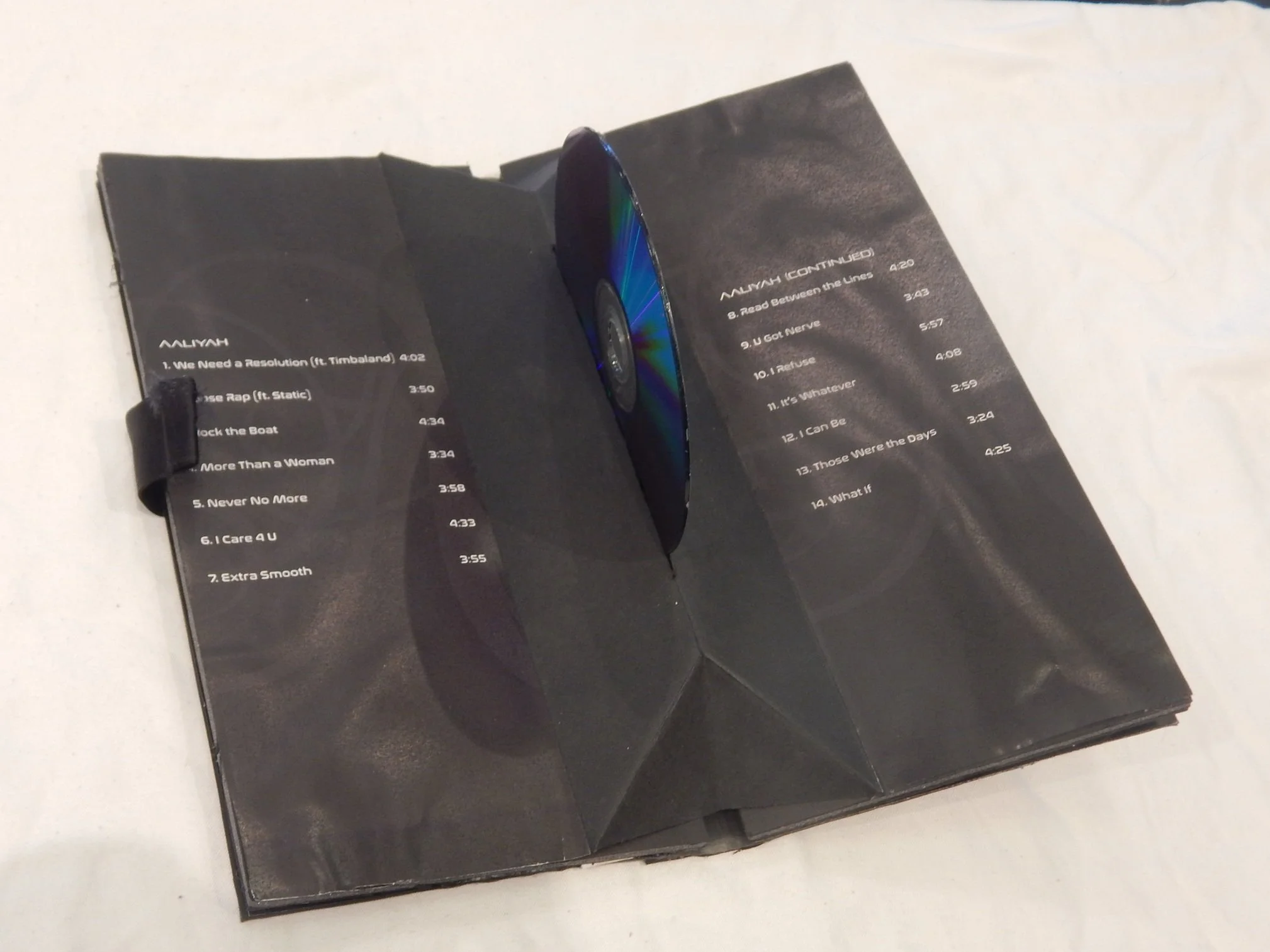
I decided not to do a traditional plastic CD case. Having done my research, I thought if I was actually redesigning an album for her, I wanted to do something special since it was the 15th anniversary of her death (author’s note: back in 2016).
So using velvet paper, cardboard, and satin ribbons, I created a case that on the outside looked like a book with a ribbon to keep it shut. I wanted it to be advertised as a “remastered, collector’s edition”. And I kept in style with the black and white theme I had touched upon in the cover page. For the fonts inside, I used the fonts Pirulen RG and Nasalization RG since I thought they most closely resembled her logo.
In the middle of the case, I found a design online where when you opened it up, the CD would “rise” out of the middle. I thought it would be a nice way to show off the CD and let it literally stand up on it’s own. Plus it was more interesting than a regular plastic CD case and I think it helps make it seem more luxurious.
If I had to go back and redo this project, I would make the case a lot thinner than it is now and I would use better glue so that the pages won’t bubble up like they have started to in the past several years. Basically, I would just redo the case.