Poster Design: 1,000 Steps
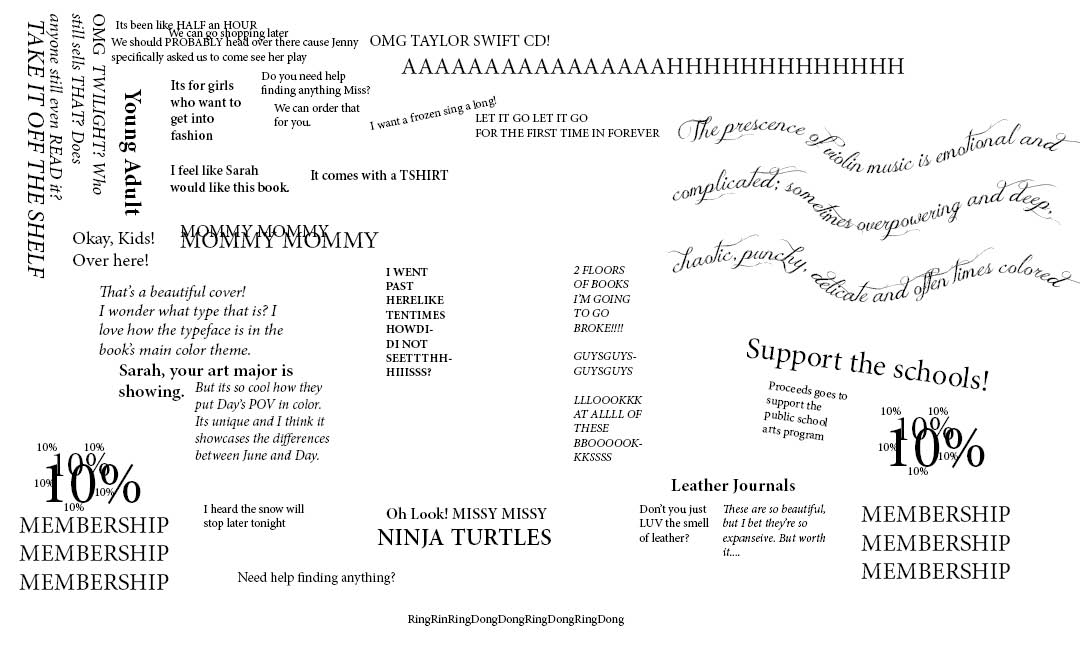
For one of my design projects back in college, we had to create a poster using only typography that represented the layout of a place. We had to take at least 1,000 steps around it and we had to design based on what we saw or heard and turn it into a visual representation.
For my place, I chose a Barnes and Noble out in West Des Moines, IA. I made mine well organized and laid out to represent the different sections and areas of the store. And to reflect the book-ish-ness of the area I was in.
That day was a particularly exciting day as they had a live violin performance and I think I brought one of my friends along with me. Using my journalism skills, I brought my recorder with me and a notepad and took lots of notes around the area. I also interviewed some shoppers there.
Overall, it was a fun assignment and I really liked the challenge. I enjoyed having to go out in the town and do a bit of research in person instead of sitting at a screen or desk all the time. My classmates also did some really interesting work so it was cool getting to see all the different variety that came from this project.
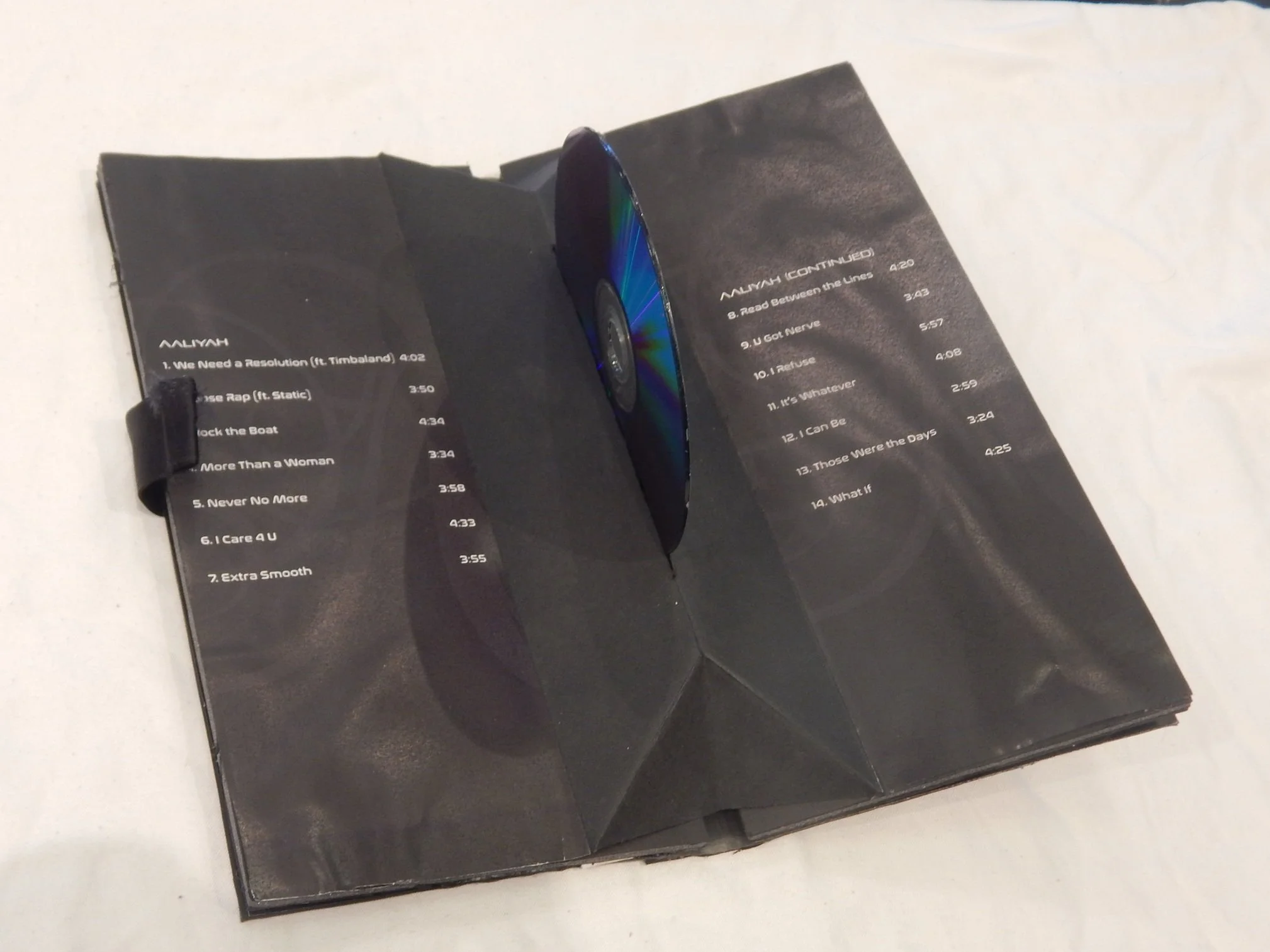
She was well known before her death at 22 and came out with three full albums and played leading roles in two movies, Romeo Must Die, and Queen of the Damned. She also was casted for the Matrix movies. She also recorded a song, “Journey to the Past” for the popular animated movie, Anastasia.
Lucky Bamboo Asian Cuisine has been serving delicious food to the greater Ankeny, IA area for years. In 2019, Lucky Bamboo was in the process of opening a location at the local community college and wanted an updated menu that better reflected their branding and was easier to read.
Card Sorting is a helpful way to categorize information and figure out your users mental models. In this presentation, I’ll break down what card sorting is, why we use it, the different types of card sorting, and how to use it effectively.
To learn front-end development, you start off with HTML, then CSS, and then Javascript. Once you've learned those, you can move on to other things like frameworks (Bootstrap, React, Angular, Vue, etc). Frameworks you can start learning once you've learned the basics of the three. Frameworks make lives easier.
