How to go From Amateur Designer to Expert by Learning Typography
I decided to write about this topic because I am under the impression that a lot of designers haven’t studied typography enough.
Now, I’m not saying everyone needs to be designing their own typography, but that I see a lot of more type choices that could have been avoided. I’m not going to call out anyone in particular in this but make some general observations I’ve made over the past year.
I see this especially with people who are self-taught or who try to design their own stuff.
While I definitely don’t think you NEED to go to college to become a designer any more, I do think it’s REALLY important to understand design theory, thinking, processes, critiques, and typography. I like to single out typography because it’s such a vast subject that the average every day person doesn’t spend a lot of time on.
You might know papyrus and comic sans and have a preference for New Times Roman over Arial.
You might even know the difference between sans serif and serif fonts.
But I don’t think a lot of designers pay attention to the details beyond the basics.
Do you know the terminology beyond kerning and leading? Orphans vs widows?
In my opinion, anyone can learn to make something pretty, but a great designer will study the details of typography.
A professional will know the ins and out of type and be able to make wise choices that will positively benefit their clients 10 years down the road. - Click to tweet
Too many times I see designers selecting type just solely based on aesthetics and on their client’s brand personality. I think it’s doubly important to make sure that every type they use is easily readable in multiple formats at multiple sizes and that it’s legible.
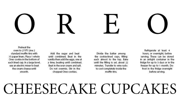
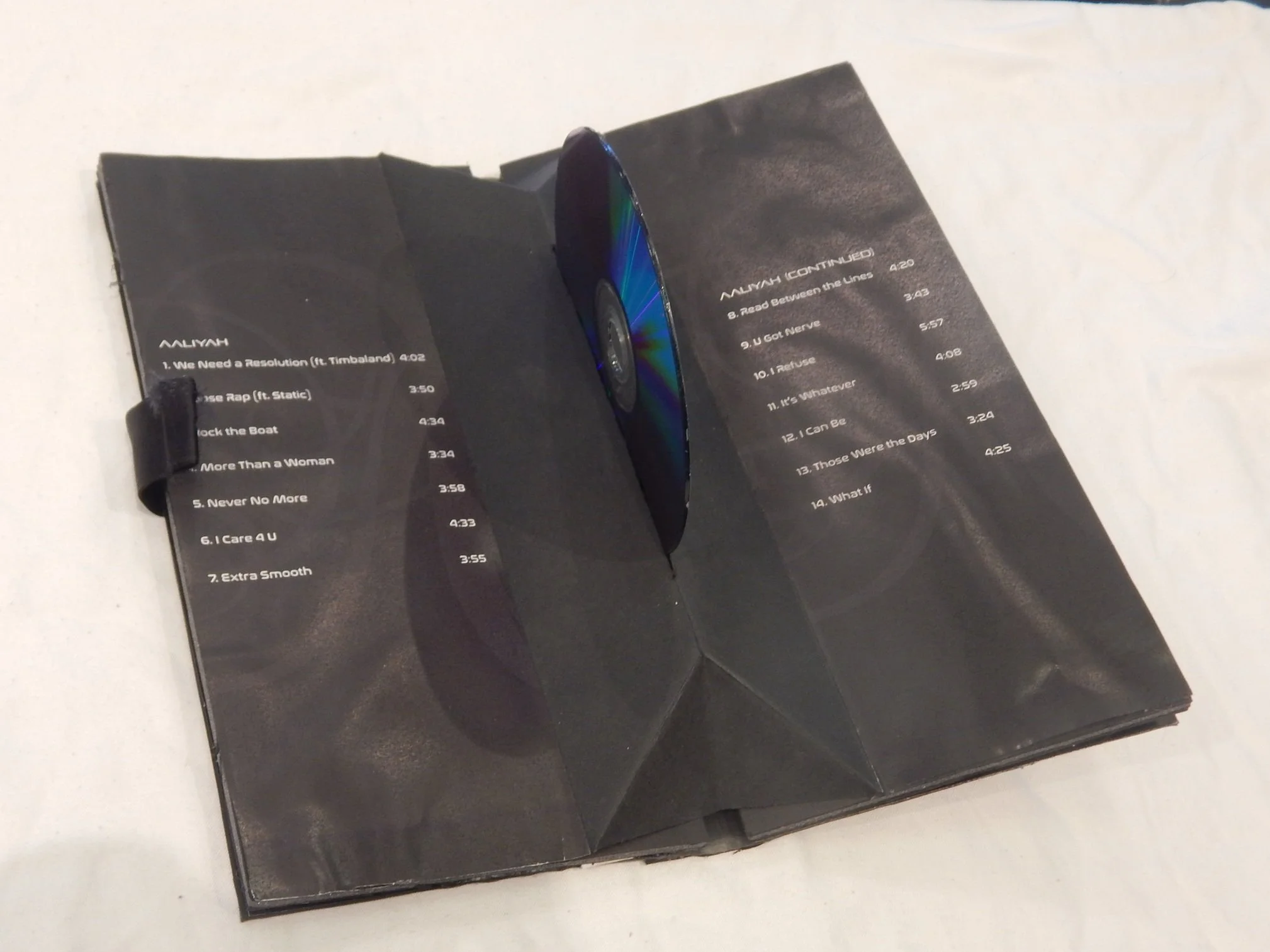
One of my first typography projects in college.
Some general rules I learned in college
Now these are not hard and fast rules, BUT I wanted to share some tips I learned in college about typography.
No more than 3 fonts at the same time
Mix and match your type
Legibility and readability over style
Don’t over justify your type; avoid rivers in between your type
Avoid large breaks in paragraph ends
No more than 30 pts positive or negative when kerning type
Avoid widows and orphans in paragraphs
Don’t default to center justify
Free fonts aren’t always well designed and usually involve a lot of extra work
Have fun with typography
There are other lists out there to check out about rules every typographer should know or watch this video. I don’t agree with all of them, but I guess it depends on how bold and daring you want to be. Personally, I think it can be fun to place type in corners and you can use more than one font.
How to get better at typography
There are lots of ways to get better at typography, especially today with free online resources.
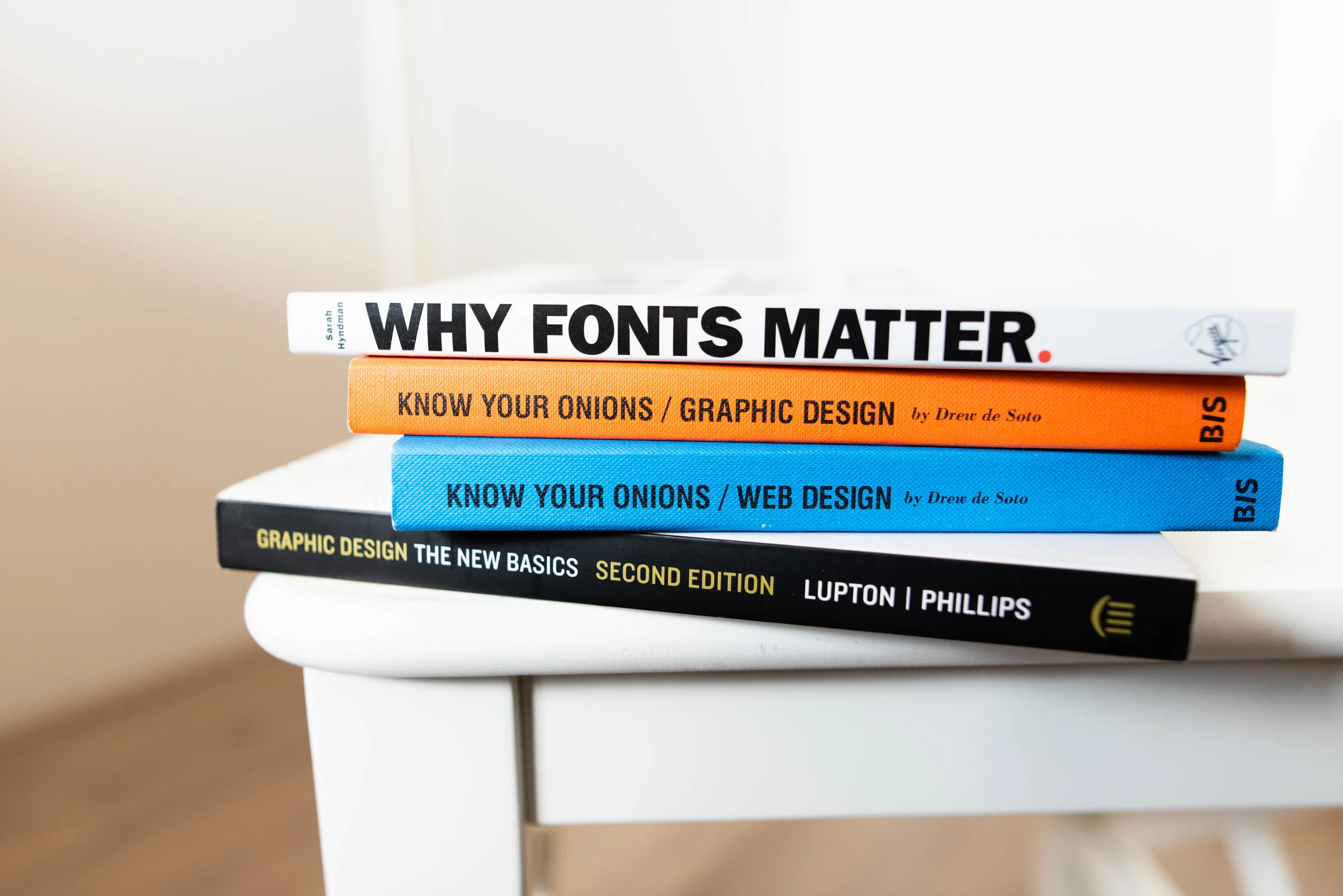
Read Books (some of my personal favorites)
Check out web standard guide lines like Material Design. It covers the styles of fonts to be used, the weight, color, etc online. Another one is Typeguide.
Check out online textbooks and online guides for typography.
Check out online classes like this one from Better Web Type, Skillshare, Linkedin Learning, and Udemy.
Study fonts you see in your every day life. Did it catch your eye or blend in? What kind of font is it? What emotion does it convey? To see cool fonts being used in real life, check out this website Fonts in Use to see even more real life versions.
Learn the anatomy of a type face like x-height and ascenders.
Check out font marketplaces and the like with Dafont, Google Font, Typekit, etc. Download free fonts and study them closer. What do you like about it? Why or why not is it a good type face?
Design your own typeface.
Look at typefaces other designers have recently created online at places like Behance.
Watch the movie Helvetica to learn more about the typeface that single handily took over the world of design.
Learn more about letterpress and the history of how type used to be set.
Learn about the standard fonts that become preloaded into your software like Ariel, New Times Roman, Brush Script, and more.
Read typography articles on Medium and Creative Bloq or other online design magazines.
Learn calligraphy.
You could make a career out of it
Being able to set good type for digital and print takes a lot of skill. It’s an aspect of design that people spend their entire careers learning and studying, basing all of their life work on.
It’s something we all see every day that most of us barely even think about.
But it can also make or break a design.
Therefore, I believe it’s really important for designers to study typography and what can make you an amateur designer to an expert designer.
You don’t need to spend your life designing the perfect typeface, although you can if you want, but knowing what makes good type from bad can really set you apart in today’s age where everything is based off of Dribble Screenshots and Behance projects.
Typography can also make you a lot of money and recognition. Maybe not on a name basis, but if you created a great font, it could become the next Helvetica. People pay thousands of dollars to be able to license out certain typefaces over other ones.
Font foundries can make good money.
If good design is in the details, then learning the details of type is a skill that will only help your career down the road.
While video is becoming more and more important typography is also increasingly important as the drive for accessibility grows stronger. And accessibility is better for everyone.
Amateur to Expert
So with all the skills to focus on in design, learning several core principles will serve you well no matter how the industry changes. Your expertise can help you stand out from all the other candidates who are simply making things look pretty. Focus on excelling in transferable areas and you will be golden.
“What do you think makes an expert designer?”


