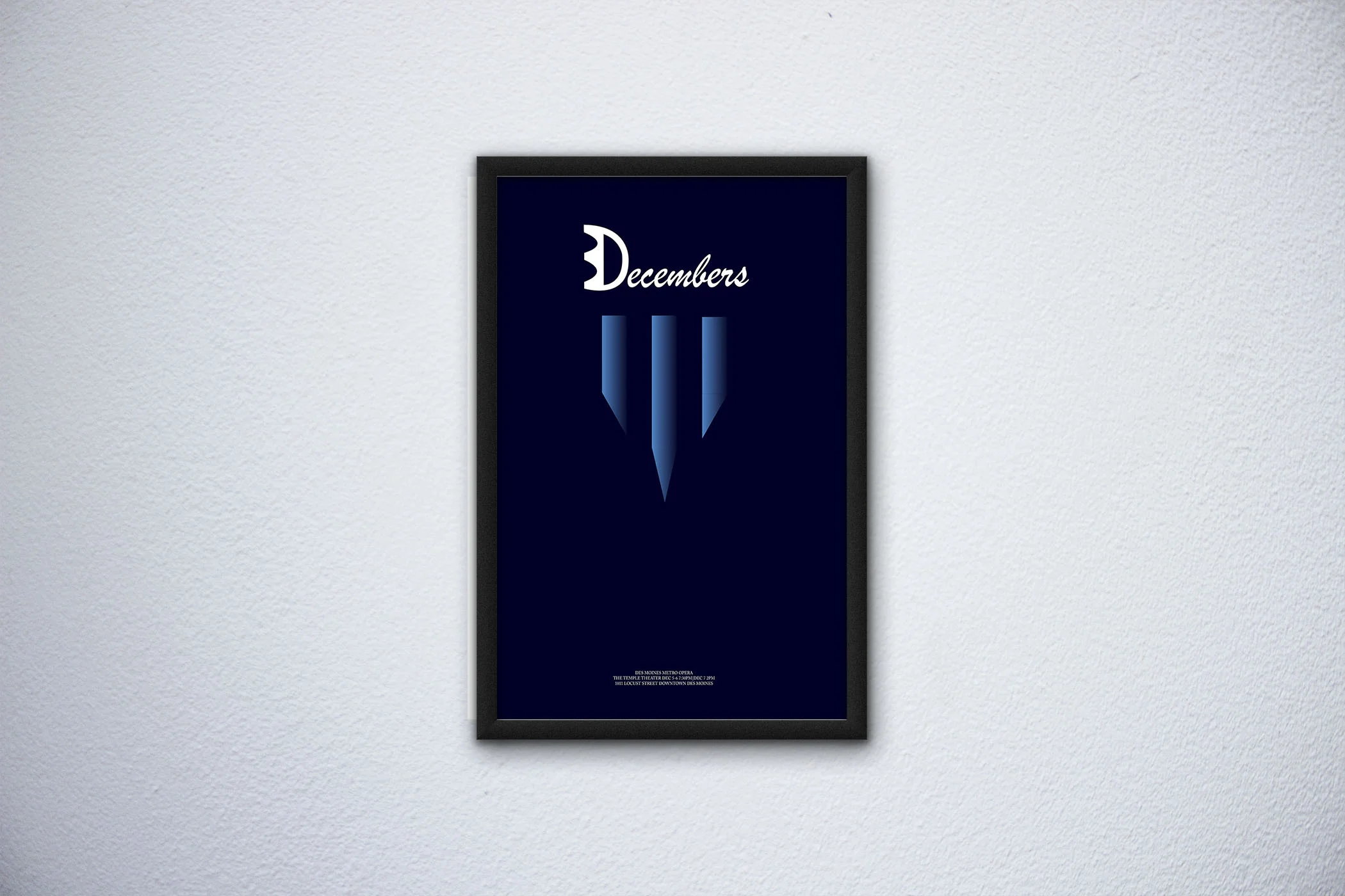
Poster Design 2015: 3 Decembers
These past couple pf entries have been looking at old design projects. This one was from 2015 for the Des Moines Metro Opera, one of their operas that winter was called 3 Decembers. It’s based on a story about some family troubles that take over the years of 3 Decembers. So I created this poster to reflect the season it was in and how the icicles reflect the 3 years it takes place over. I tried combining the 3 and Decembers together to reflect the family. If I went back and redid this, I would refine the combination of the hand drawn 3 and D. I would make it look less like an E and more like a 3. Otherwise, I really like how simple the poster is and the cold vibes it gives off.

